Chart
Dashboard Designer provides users with the ability to create detailed reports, allowing you to generate Pivot-type charts that offer a deep and dynamic view of your data. This enables you to analyze and visualize trends intuitively.
Steps to Create a Chart Filter:
- Open Dashboard Designer.
- Create a new report or open an existing one.
- Click on the "Chart" icon.
- Drag and drop the columns from the main view to the "Columns" section of DATA ITEMS.

Dashboard Designer also provides various options to customize the 'Chart' based on the data type displayed in each column. Below is a general overview of the different options you can apply to your Chart Designer.
Column of type String
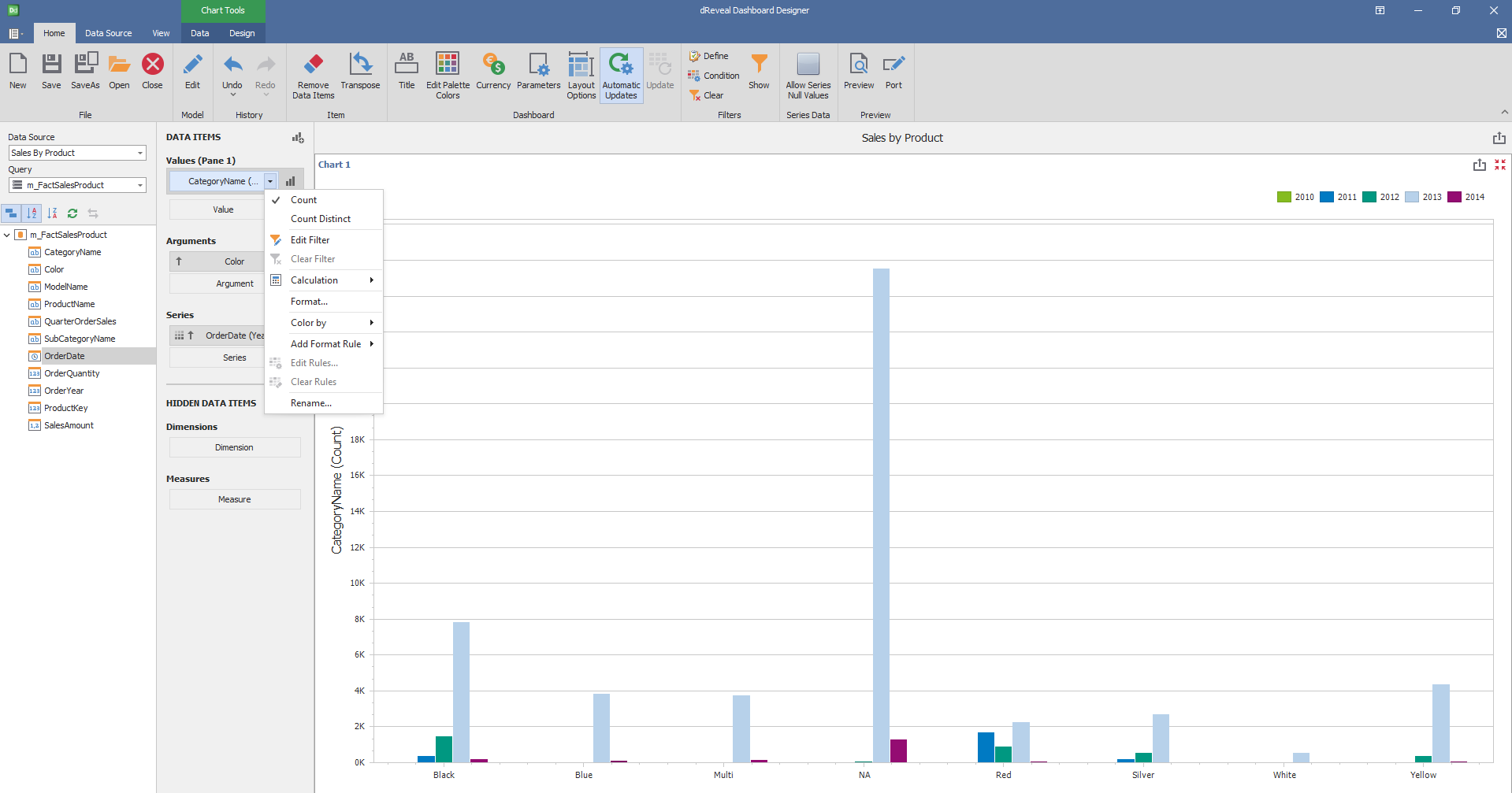
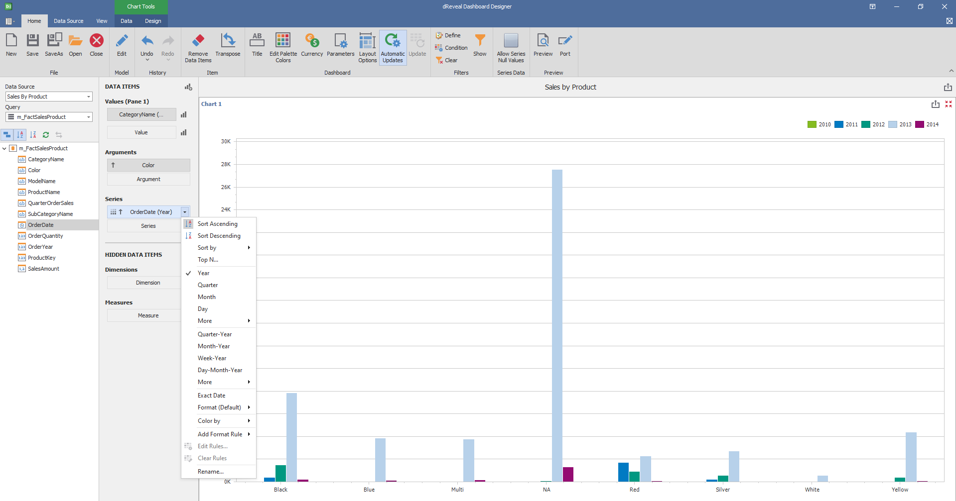
Column of type Date:
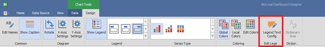
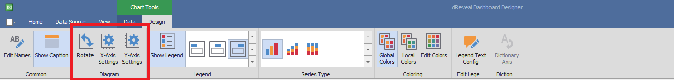
Design
'Designer Chart' has a variety of options in the 'Design' tab to customize your chart. Next, we will show you the different options you can apply to your Chart.
Diagram
| Options | Description |
|---|---|
| Rotate | Rotate the diagram at 90º. |
| X-Axis Settings | Customize various X-Axis Settings, such as the visibility and Axis Title. |
| Y-Axis Settings | * Customize various Y-Axis Settings, such as the visibility, title and displayed range.* |
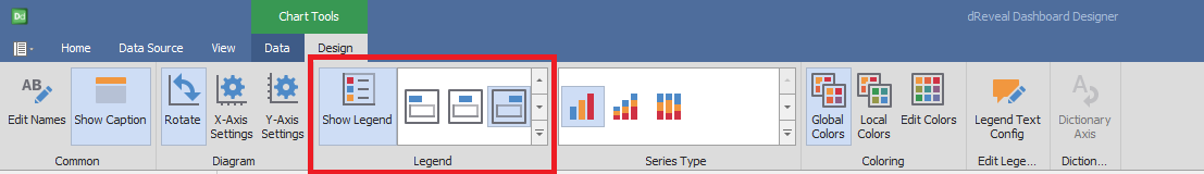
Legend
| Options | Description |
|---|---|
| Show Legend | Show the legend that helps end-users identify chart elements. |
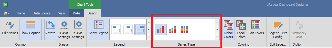
Serie Types
| Options | Description |
|---|---|
| Bar | Specifies bar-separated data values. |
| Stacked Bar | Specifies the data by separating the values on the same bar. |
| Full-Stacked Bar | Specifies the data at 100% by separating the values on the same bar. |
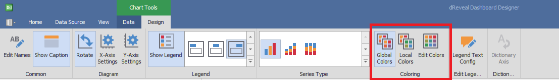
Coloring
| Options | Description |
|---|---|
| Global Colors | Use a global scheme to color elements of a dashboard item. |
| Local Colors | Use a local scheme to color elements of a dashboard item. |
| Edit Colors | Specify colors used to color elements of a dashboard item. |
Edit Legend
| Options | Description |
|---|---|
| Legend Text Config | * Demonstrates which combinations will be shown in the legend texts. * |